nationAL fried chicken festival
*
nationAL fried chicken festival *
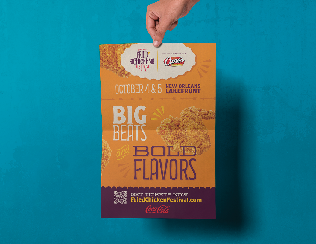
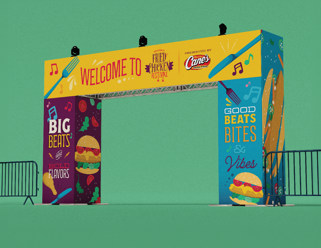
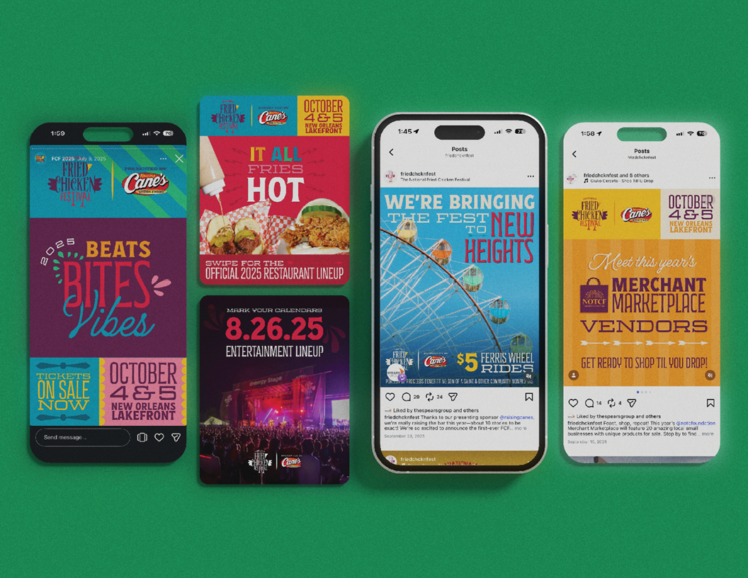
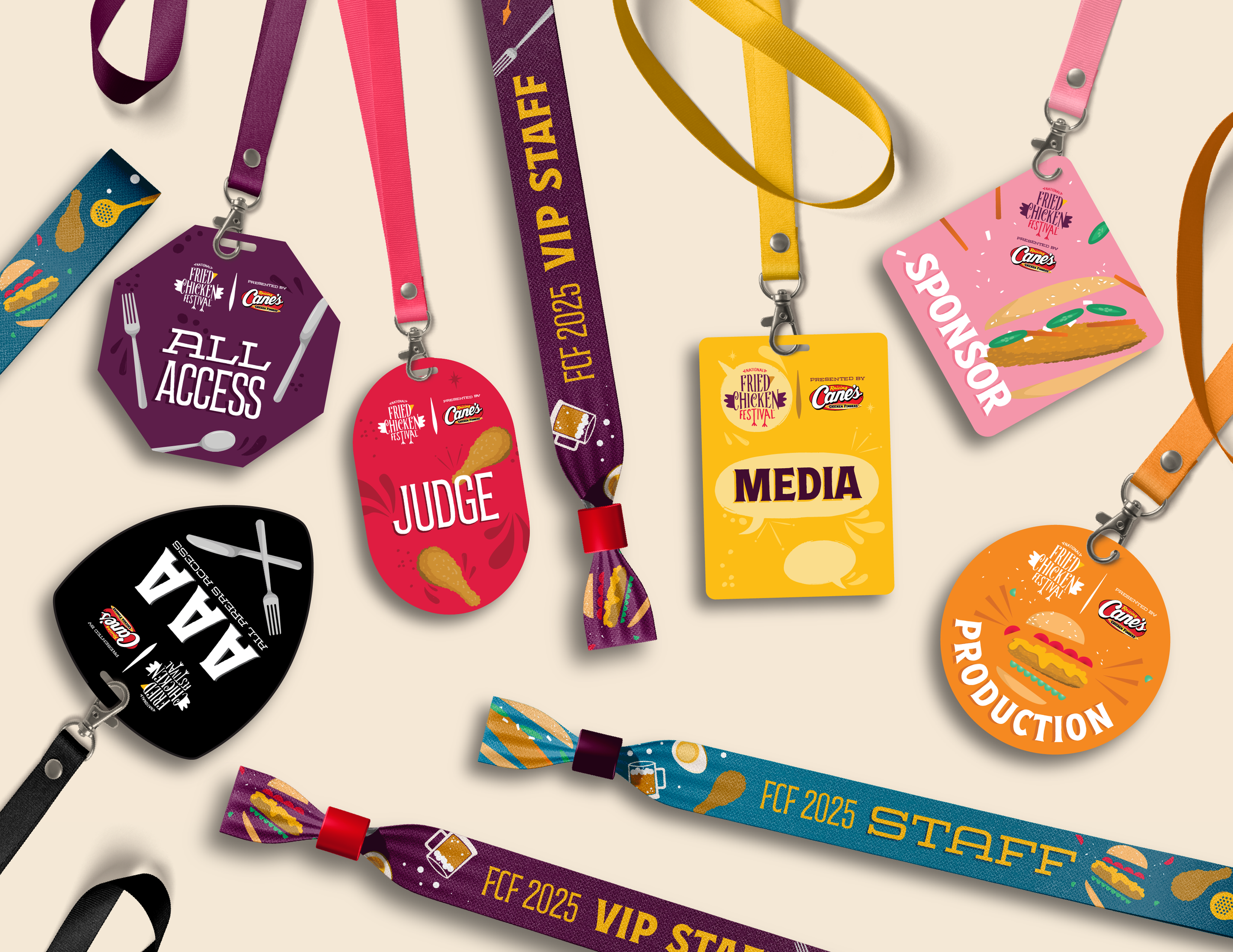
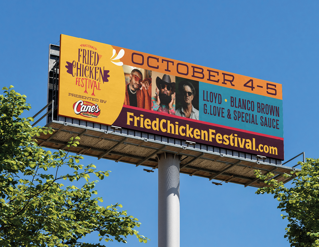
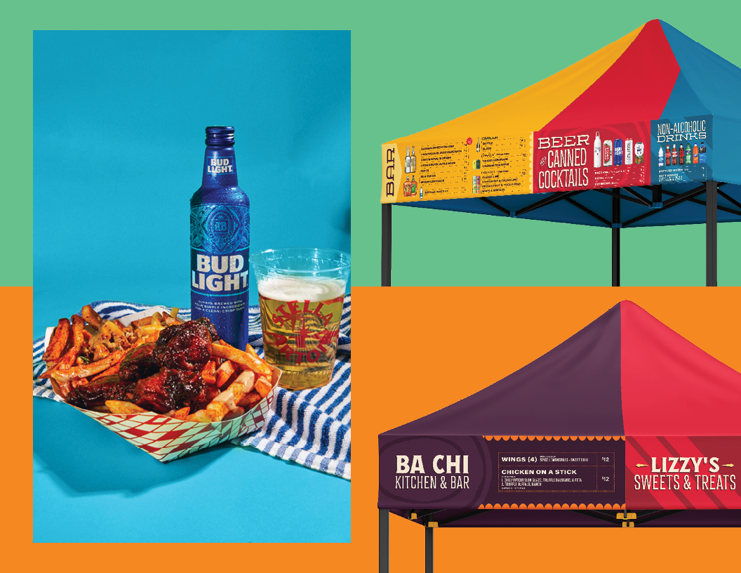
employing bright colors and expressive illustrations, the brand is able to maintain its integrity while becoming more dynamic. Each color pairs with an element of the festival — some food, some atmospheric, all pieces of the experience.
Awards
american advertising awards
gold addy
2025
overview
contributors
Emily Bond, Lead Designer
Mary Louise Killen, Creative Director
Jourdan Bates, Junior Designer
all work done for
national fried chicken festival
via festivals for good & spears group
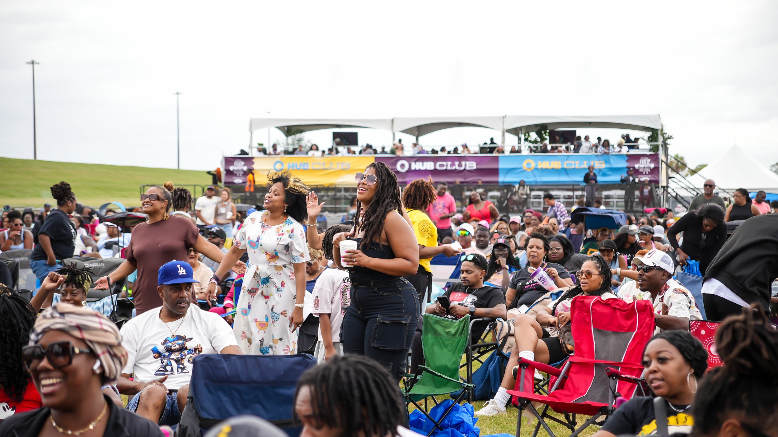
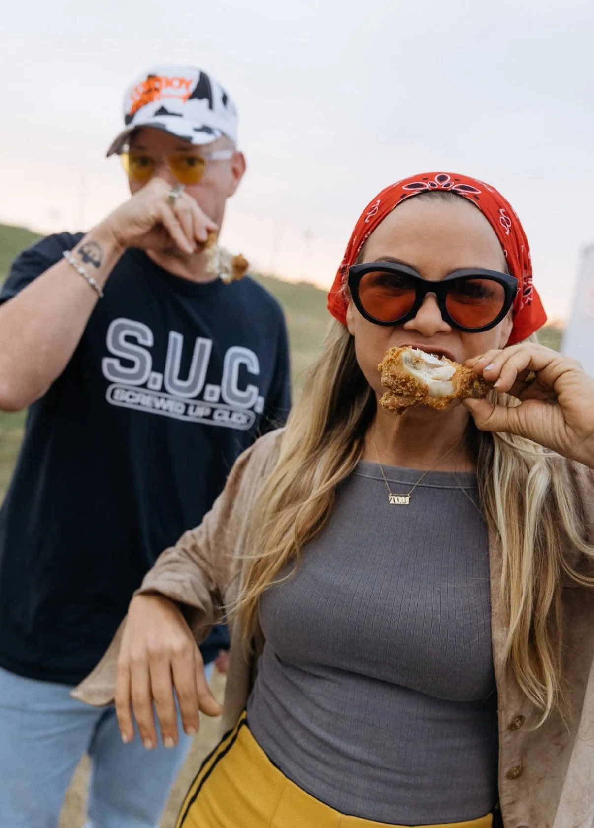
Few things bring people together in quite the same way as food, and what food is adored in the American South quite like fried chicken. That idea is the foundational piece of the National Fried Chicken Festival. The festival is the landmark product for its parent companies, Spears Group & Festivals for Good.
As events endure, inevitably they change and they grow. Nine years into production, the festival was due for a refresh. Previous years have had campaigns that focus mainly on the namesake food, but as the festival has grown it had become evident that music is just as big of a draw to the festival. Following the natural evolution of the event, the graphics in this refresh evolved to include more expressive marks and more overtly music-related imagery to more accurately encapsulate the full experience.
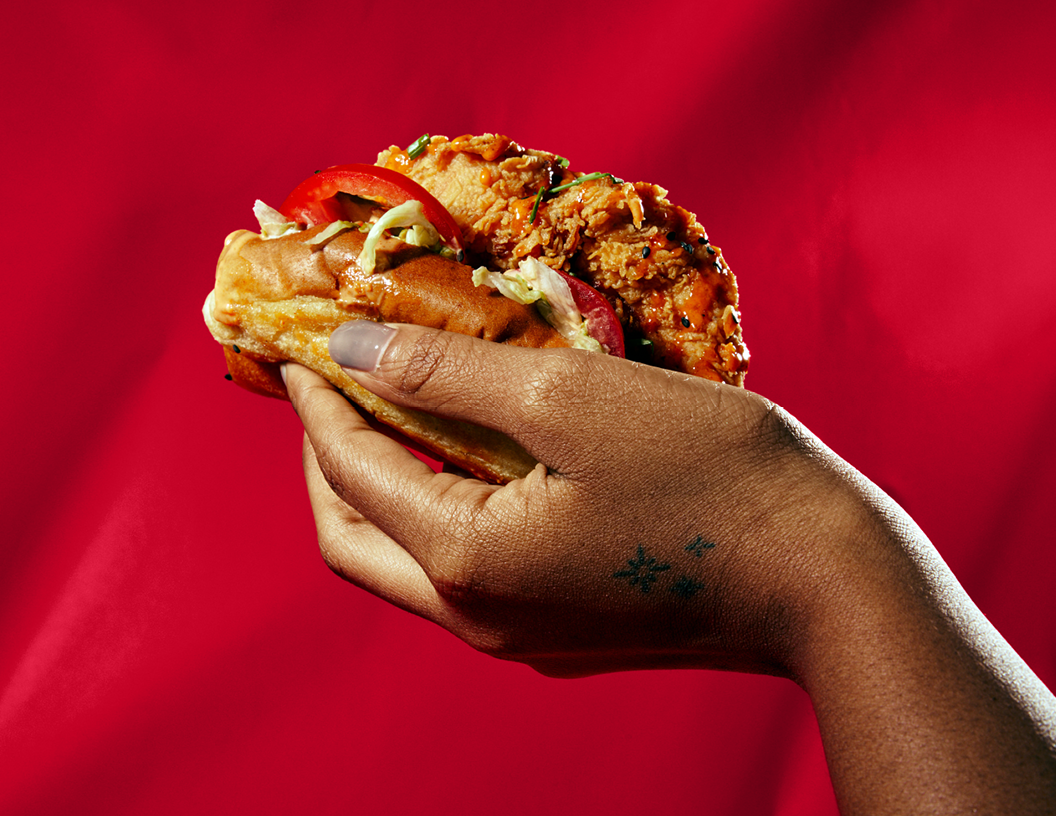
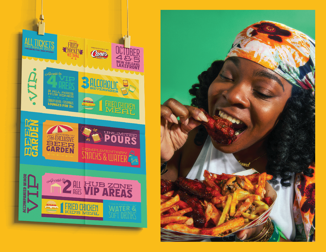
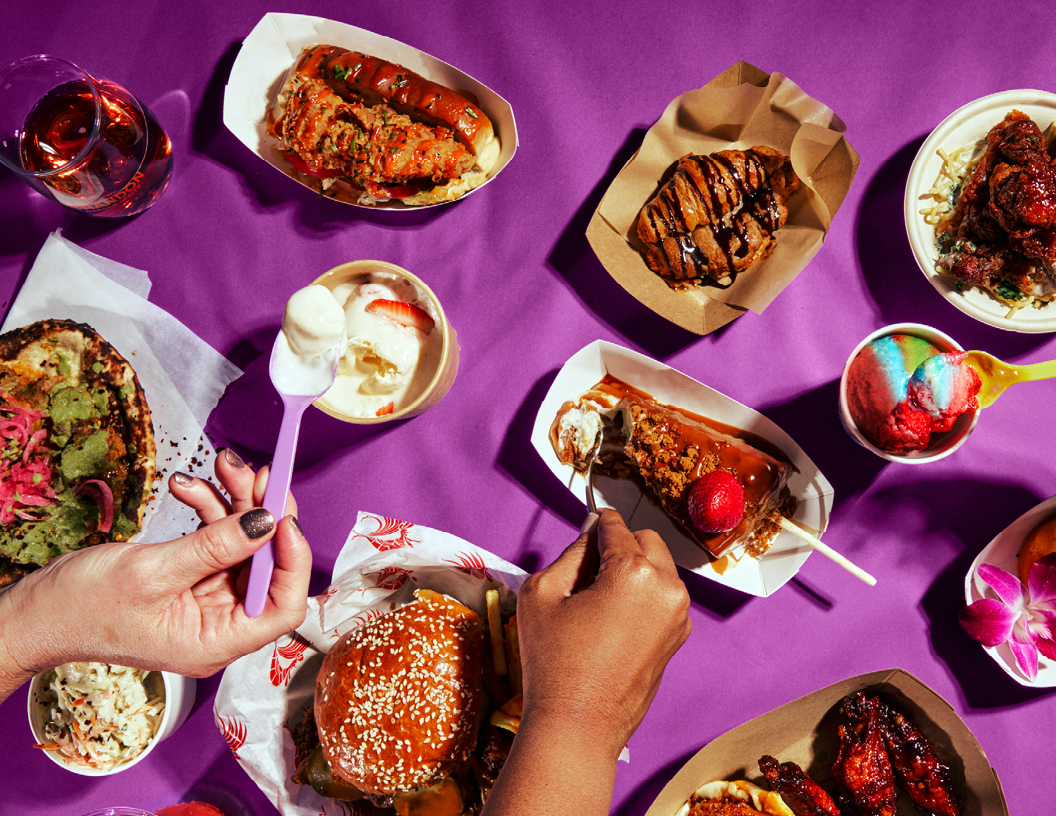
The food imagery itself has also expanded to reflect that this is about more than just chicken on its own. The variety of offerings is a huge part of consumer appeal, so the imagery now follows suit, showing sandwiches, drumsticks, and fried chicken bahn mi to name a few, acting as a visual sampling of the food awaiting patrons.
Including leafy greens, juicy tomatoes, crispy chicken, and so much more is food for the eyes, introducing much more opportunity for color, texture, and shape contrast and variety.
All work displayed has been done in collaboration with named contributors.